Introduction
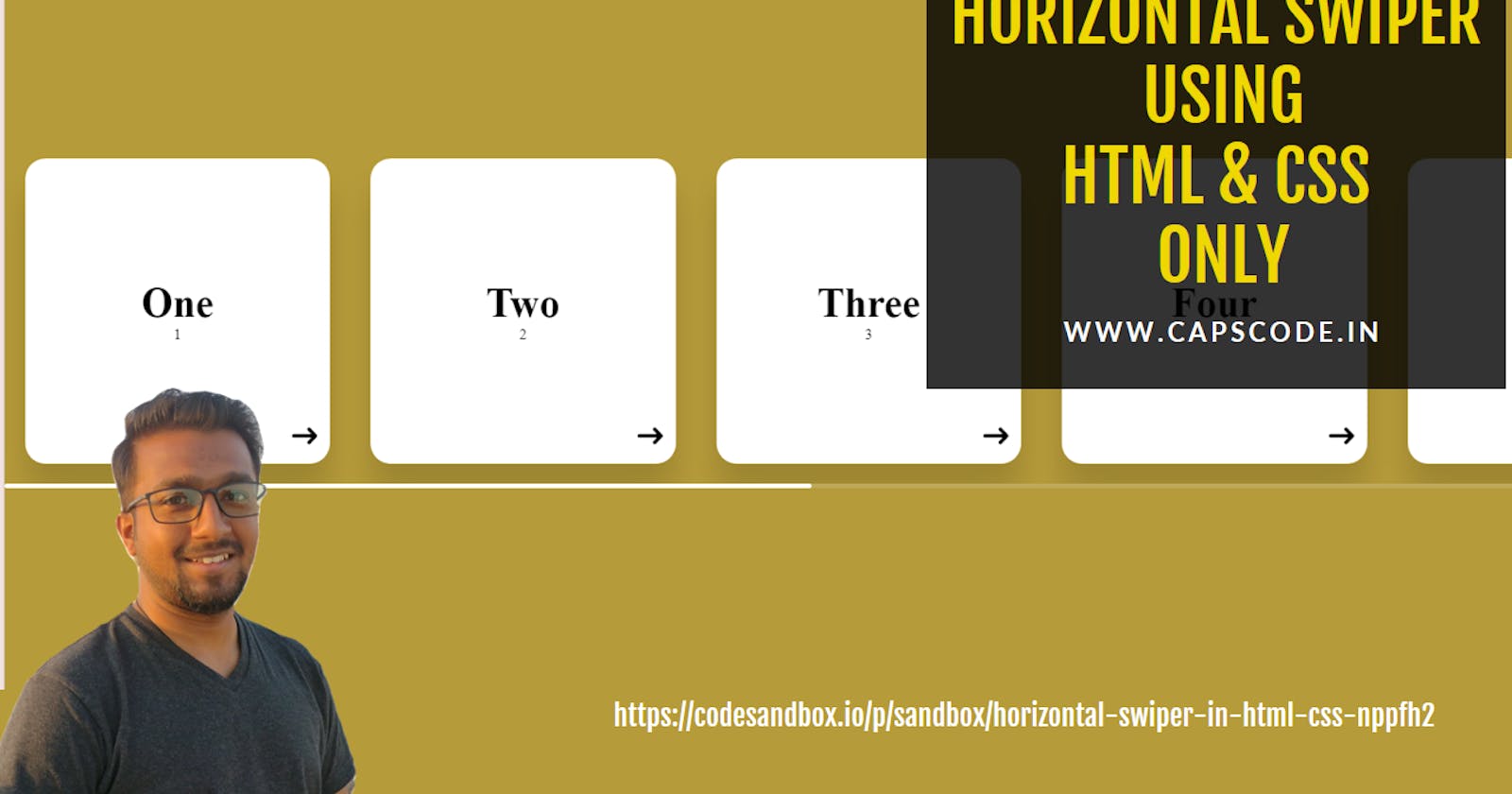
In the world of web development, creating interactive and engaging user interfaces often requires the use of JavaScript or external libraries. However, there are instances where a simple solution can be crafted using just HTML and CSS. In this article, we'll explore the process of building a horizontal swiper without relying on any JavaScript or external libraries.
Swipers or sliders are commonly used elements in web design to showcase content in a visually appealing way. While JavaScript-powered sliders are prevalent, the challenge lies in creating a slider using only HTML and CSS. Let's embark on this coding journey together.
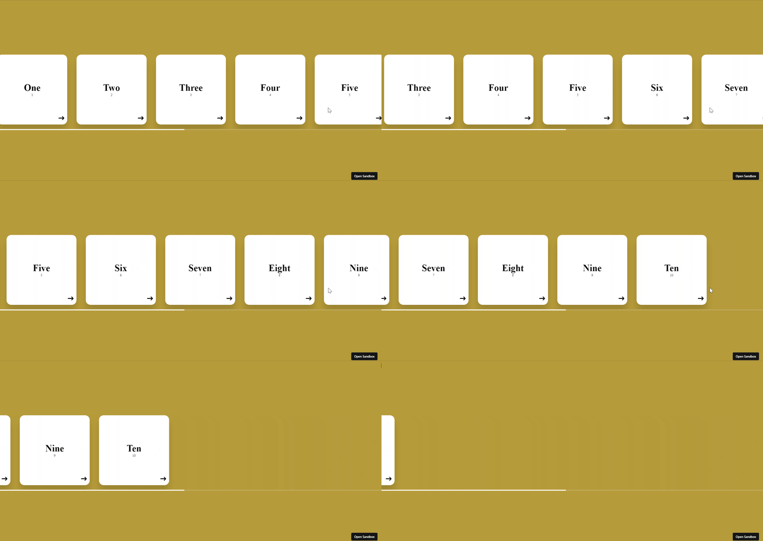
What we are building

HTML Structure
To begin, we'll structure our HTML to create a container for the swiper and individual items to be swiped. Here's a basic example:
<!DOCTYPE html>
<html lang="en">
  <head>
    <meta charset="UTF-8" />
    <meta name="viewport" content="width=device-width, initial-scale=1.0" />
    <title>Horizontal scroll only using html css</title>
  </head>
  <body>
    <div class="container">
      <div class="slider-container">
        <div class="cards-holder">
          <div class="card">
            <div class="title">One</div>
            <div class="subtitle">1</div>
            <span>➜ </span>
          </div>

          <div class="card">
            <div class="title">Two</div>
            <div class="subtitle">2</div>
            <span>➜ </span>
          </div>

          <div class="card">
            <div class="title">Three</div>
            <div class="subtitle">3</div>
            <span>➜ </span>
          </div>

          <div class="card">
            <div class="title">Four</div>
            <div class="subtitle">4</div>
            <span>➜ </span>
          </div>

          <div class="card">
            <div class="title">Five</div>
            <div class="subtitle">5</div>
            <span>➜ </span>
          </div>

          <div class="card">
            <div class="title">Six</div>
            <div class="subtitle">6</div>
            <span>➜ </span>
          </div>

          <div class="card">
            <div class="title">Seven</div>
            <div class="subtitle">7</div>
            <span>➜ </span>
          </div>

          <div class="card">
            <div class="title">Eight</div>
            <div class="subtitle">8</div>
            <span>➜ </span>
          </div>

          <div class="card">
            <div class="title">Nine</div>
            <div class="subtitle">9</div>
            <span>➜ </span>
          </div>

          <div class="card">
            <div class="title">Ten</div>
            <div class="subtitle">10</div>
            <span>➜ </span>
          </div>
        </div>
      </div>
    </div>
  </body>
</html>
CSS Styling
Now, let's style our swiper using CSS. We'll use flexbox to achieve the horizontal swiper effect:
      body {
        width: 100%;
        height: 100vh;
        margin: 0;
        padding: 0;
        background: rgb(182, 155, 58);
      }
      .container {
        width: 100%;
        height: 100%;
        display: flex;
        align-items: center;
        justify-content: center;
      }
      .slider-container {
        width: 100%;
        height: fit-content;
        padding: 20px 0;
        overflow: auto;
      }
      .slider-container::-webkit-scrollbar {
        width: 80px;
        height: 5px;
      }
      .slider-container::-webkit-scrollbar-thumb {
        background: rgb(255, 255, 255);
        border-radius: 10px;
      }
      .slider-container::-webkit-scrollbar-track {
        background: rgba(224, 224, 224, 0.2);
      }

      .cards-holder {
        width: fit-content;
        display: flex;
        align-items: center;
        justify-content: center;
      }

      .card {
        width: 300px;
        height: 300px;
        background: white;
        box-shadow: 0 30px 30px rgba(0, 0, 0, 0.14);
        display: flex;
        align-items: center;
        justify-content: center;
        flex-direction: column;
        position: relative;
        margin: 0 20px;
        border-radius: 20px;
      }
      .title {
        font-size: 40px;
        font-weight: 600;
      }
      .subtitle {
        font-size: 14px;
      }
      .card span {
        position: absolute;
        bottom: 10px;
        right: 10px;
        font-size: 30px;
      }
Animation
If you want the cards to be moving then you can define a keyframe as below and add the animation effect in cards-holder or card class names.
.cards-holder {
    width: fit-content;
    display: flex;
    align-items: center;
    justify-content: center;
    animation: scroll 10s linear infinite;
    }

    .card {
        width: 300px;
        height: 300px;
        background: white;
        box-shadow: 0 30px 30px rgba(0, 0, 0, 0.14);
        display: flex;
        align-items: center;
        justify-content: center;
        flex-direction: column;
        position: relative;
        margin: 0 20px;
        border-radius: 20px;
        /* animation: scroll 10s linear infinite; */
        /* YOU CAN ADD HERE AS WELL BASED ON REQUIREMENT */
      }

@keyframes scroll {
        0% {
          transform: translateX(0);
        }
        100% {
          transform: translateX(-100%);
        }
      }
This CSS defines the basic structure of our swiper, including the container, wrapper, and individual items.
Conclusion
And there you have it! A simple horizontal swiper created using only HTML and CSS. This approach provides a lightweight solution for scenarios where JavaScript might be unnecessary or undesired.
Feel free to customize the styles, add more items, or enhance the functionality as per your project requirements. This pure HTML and CSS swiper is a testament to the versatility and power of these foundational web technologies. Happy web dev!
